
NYU’s Summer Publishing Program
For the month of June, NYU hosts the “Summer Publishing Program” (SPI) where they teach college graduates and rising seniors about the ins and outs of the publishing industry. For our final project, we had to create an imprint (my group got the YA Genre) and establish a lead title, two secondary titles, a marketing campaign, a sales pitch, and fill out product and loss statements like a real imprint would. I was part of the design team, where I worked on the cover for our lead title, a secondary title, the logo, and some advertisements for the lead title. The following shows the elements I created for our final project.

Buttons we designed for our press
Creating a Brand


Since the design was so delicate, we came up with a line logo for promotional materials and our website, and a solid color version that we could use on the spines of our book. We also decided that the color of the logo would change to match the color scheme of the title, which can be seen in the design of our lead title.


Editorial was tasked with writing our mission statement, but we all ultimately pitched in on the values of our imprint. We were given the YA genre, so we discussed what our age range would look for, and what we liked at that age. We wanted to emphaize growth and retellings, finding that these are the stories that stuck with us the most. With that in mind, this was our final mission statement:
“Pallas Press publishes universal heartfelt coming-of-age stories for young readers that can be shared through generations. We focus on works inspired by timeless classics and visions of the future. ”
With these things in mind, I worked on creating the logo. We talked a lot about butterfly imagery, so I knew that was important for our logo. Our name is also a reference to a Greek titan associated with war, which is where we got the spear from. Additionally, since we’re working with books, we wanted to include some quill imagery. This is the final logo and style guide we came up with for our brand.
Working on our Lead Title
Front Cover Design
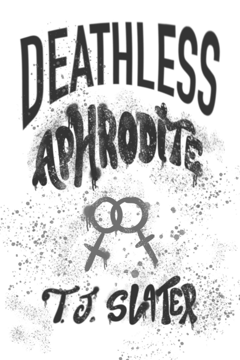
After receiving the description of our lead title from Editorial, I got to work on the main design. The story we went with was a reimagining of the story of Sappho, a Greek poetess known for her queer poetry. I drew inspiration from classical and neo-classical art, choosing a statue of Aphrodite as the central image. We decided against including an explicitly queer couple on the cover, since we’re working with YA audiences who may still be in the closet.
Since this book is a blend of old and new ideas, I decided to use that contrast to my advantage, combining “high culture,” classical sculpture with “low culture” spray-paint and graffiti effects to make an interesting and striking artwork. I also drew inspiration from the radical feminist group, the Guerilla Girls, who focus on bringing awareness to women’s issues, especially in the arts. I felt that this imagery was fitting, since we’re bringing a previously underrepresented female artist to light with our book. Lastly, I included an illustrated image of the author in a “Greek” style, since we didn’t have a real author to work with anyways. I felt like this added a nice touch and made the whole jacket look very cohesive.

Interior Design
Since I had more illustration experience compared to my group members, I was also asked to do some of the interior elements of our lead title. I created the title page, chapter heads, and page break illustrations, drawing on rose imagry for the love aspect of the story, lavender sprigs to reference queer history and culture, and a quill to reference Sappho’s role as a poet. Here are the design elements and some sample pages:

The last thing I did for our lead title was put together some marketing materials. Since I already had all the assets from the cover, I volunteered to do these. I made 4 promotional banners that could be displayed on Goodreads, Barnes and Noble, and Amazon, leading consumers to our preorder campaign, and 2 poster/advertisement designs that could be on various websites, social media, and in the author newsletter. Additionally, I created a banner for the author’s twitter feed, and a banner for her newsletter. All of these can be seen bellow.


Marketing Materials
Working on the Secondary Title
Front Cover Design
For our secondary title, we went with a cli-fi book about the Climate Change clock hitting zero. We had various ideas for this title, but knew that climate change and clock imagery would be vital. We also liked the idea of using newspaper headlines. This was ultimately the design I came up with. While it wasn’t the one our final group came up with, it was still a fun project and a great learning opportunity. This is also where I gained experience designing galley covers, learning what advance reading copies look like in the real world.

