Project Two
Pallas Press: NYU’s Summer Publishing Institute
NYU’s Summer Publishing Institute
“Pallas Press publishes universal heartfelt coming-of-age stories for young readers that can be shared through generations. We focus on works inspired by timeless classics and visions of the future.”
- Pallas Press Mission Statement
For the month of June, NYU hosts the “Summer Publishing Program” (SPI) where they teach college graduates and rising seniors about the ins and outs of the publishing industry. For our final project, we had to create an imprint (my group got the YA Genre) and establish a lead title, two secondary titles, a marketing campaign, a sales pitch, and fill out product and loss statements like a real imprint would. I was part of the design team, where I worked on the cover for our lead title, a secondary title, the logo, and some advertisements for the lead title. The following shows the elements I created for our final project.

Imprint logo design


There were a few key symbols we wanted for our logo. We talked a lot about butterfly imagery to represent change, references to Greek mythology (which is where “Pallas” comes from), and quill imagery. I combined these three symbols to make this logo.
Designing a Lead Title

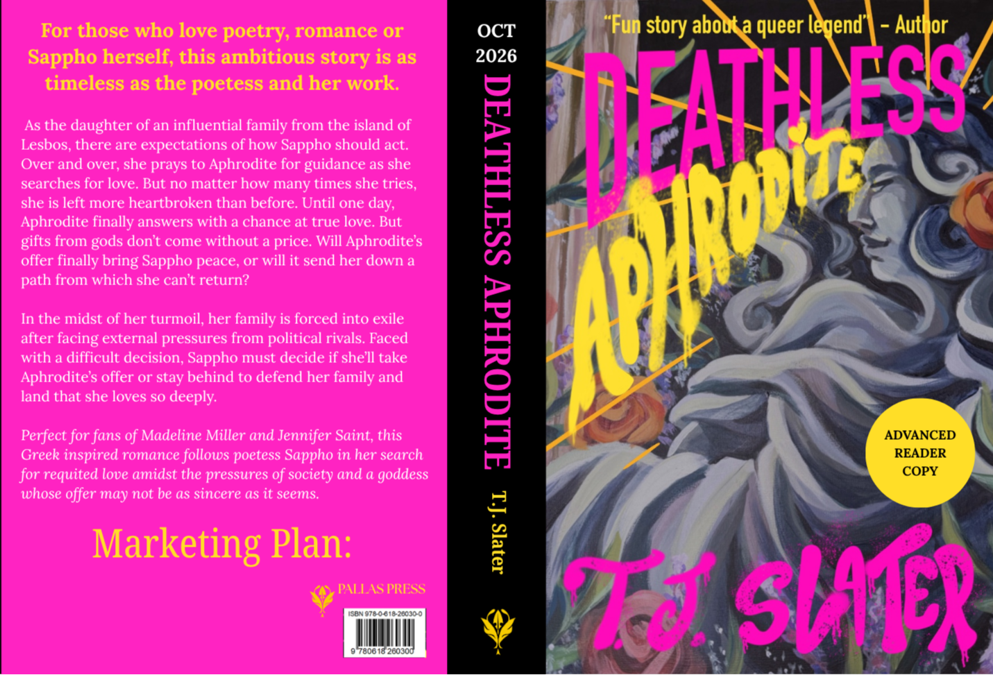
As a group, we came up with ideas for “stories” our imprint would “publish.” We talked a lot about the kinds of books we read in middle and high school and talked about fairytale/Greek mythology retellings. We also wanted to emphasize representation in our books, as a group of women from a very diverse background. We settled on Deathless Aphrodite for our lead title, a book that re-imagines the story of Sappho in a coming-of-age YA story. For my design, I included an acrylic painting inspired by classical sculpture that’s seemingly at odds with the punk-style graffiti hand lettering, reflecting Sappho’s own out-of-place nature in Greek history. The color scheme is inspired by the feminist group, the Guerrilla Girls, whose protest art called out the erasure of women in the arts, just as the queer expression of Sappho’s poetry has been repeatedly obscured. This bold, loud cover demands attention, refusing to let Sappho’s legacy go unnoticed.

Interior Design
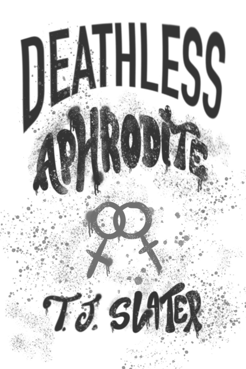
For the interior design, I wanted to include different elements from the cover, including the graffiti style markings (top left), writing imagery (quill page breaks), and floral imagery, using a rose to represent romance, and sprigs of lavender as a reference to the LGBTQ+ community. This mockup also included text from a “first chapter” of the book that one of my groupmates wrote in her spare time.

Interior design element (above) used for page breaks


Marketing materials


Author twitter banner (top left), author newsletter banner (middle left), advertisement banner (bottom left), advertisement (right), and ARC design (bellow)
Re-designing the Lead Title
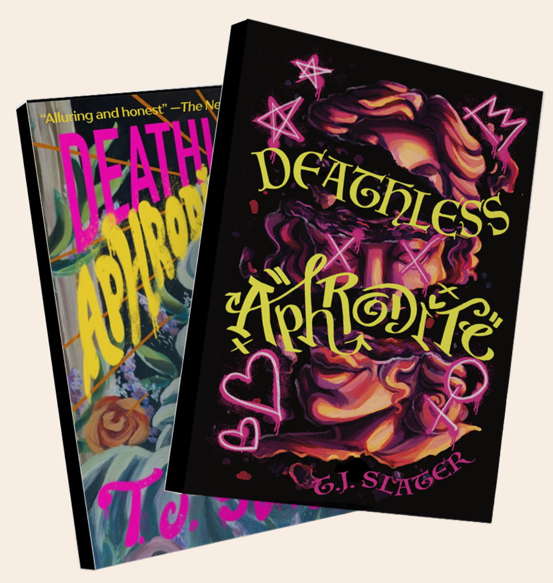
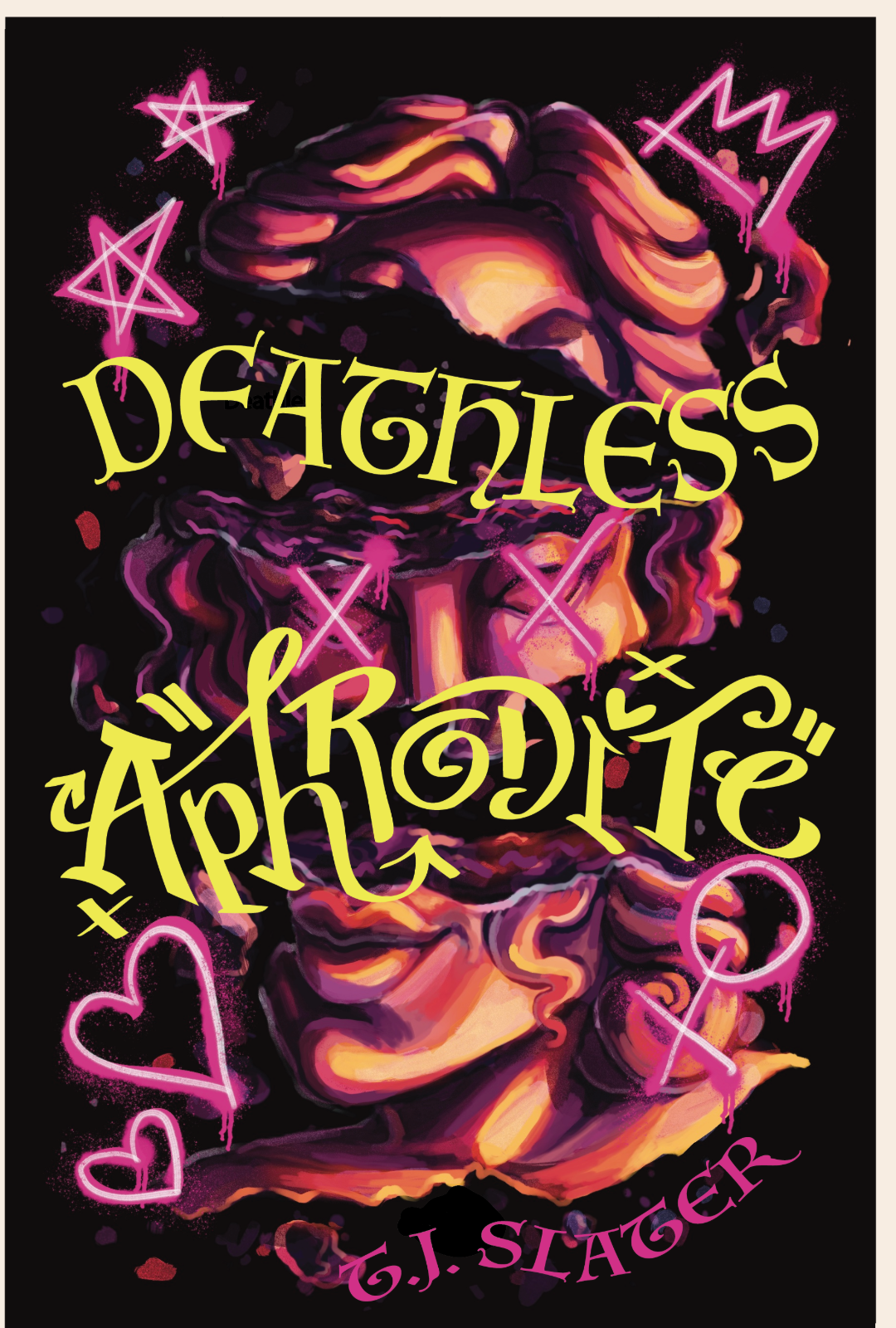
A year (and a few months) after going to NYU, I completed most of my Book Cover Redesigns featured in my portfolio. Looking at copious editions of books at my job at a used bookstore, and having made a few more book designs, I picked up on some elements that weren’t working with my original design. The title font was slightly illegible, and not exactly in the “graffiti” style I wanted, the illustration needed to feel more purposeful, and I wanted more references to this book being a queer story. In the original, we emphasized not showing a queer couple on the cover, so that closeted teens would feel comfortable reading it at home or in public. While it did achieve this goal, it was a little too subtle for my taste, which is why this design makes sure to specifically use colors from the lesbian flag, along with all the other symbols I used in the previous design.


Secondary Title ARC Design
In addition to our lead title, we were tasked with creating a secondary title with a cover and ARC design. This design is for a dystopian book centered around climate change, and a group’s determination to reverse it before its too late. Inspired by our proximity to the Doomsday Clock in NYC, I came up with a collage design to match the book’s tone, while appealing to a younger audience.
