Book Cover redesigns
To expand my portfolio, I started redesigning book covers for books that shaped my worldview; whether they are comforting and nostalgic like the Percy Jackson series by Rick Riordan, or resparked old passions like Project Hail Mary by Andy Weir, all of these books meant something to me at some point (and my own copies are well loved). Each design includes acrylic paintings with uniquely designed hand lettering and reflects my willingness to experiment with new ideas and find imaginative solutions to various design problems. So far, I redesigned covers for Carry On by Rainbow Rowell, Project Hail Mary by Andy Weir, and Percy Jackson and the Olympians: The Sea of Monsters by Rick Riordan.
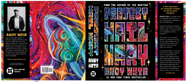
Project hail mary by andy weir
After reading Project Hail Mary, I knew I had to add it to my list of book cover designs. Before this book, I didn’t read much sci-fi, and I honestly only picked this book up because the movie trailer led me to believe this was a cosmic horror in space (it’s definitely not). I fell in love with Weir’s prose, and the book reignited my childhood love of all things outer space. I began to think more on why I’ve avoided sci-fi books for so long, considering I do have a baseline interest in all things science, and started thinking about how these books were designed. There was a debate following Project Hail Mary’s movie release about the gendering of fantasy and sci-fi genres, even though they’re typically grouped together, and sit on a spectrum between high fantasy and high sci-fi. A lot of people pointed out that, since fantasy was seen as a genre “enjoyed by women,” it usually held less value than other sci-fi books, unless it’s written by the infamous J.R.R Tolkien. I began to analyze how fantasy and sci-fi book covers were made with these demographics in mind, coming across frequent editions at my job in a used bookstore. With this design, I wanted to eliminate some of the more masculine-appealing looks of typical sci-fi covers, while still making it very apparent that this book was still in the sci-fi genre, since the movie adaptation created a large female fanbase for this book. I created a detailed, whimsical illustration that may be more typical of fantasy covers, and paired it with industrial, blocky text that seems reminiscent of most sci-fi books (and drew inspiration from a vintage NASA poster). The end result is a cover that I would be more likely to pick up off of shelves, and, in my opinion, celebrates human connection like the book does, using something created by hand rather than showcasing something completely removed from humanity.

Carry On by Rainbow Rowell
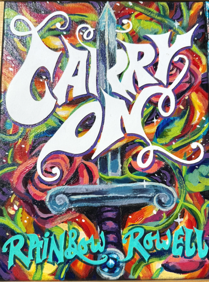
My cover design, 2025, acrylic on canvas
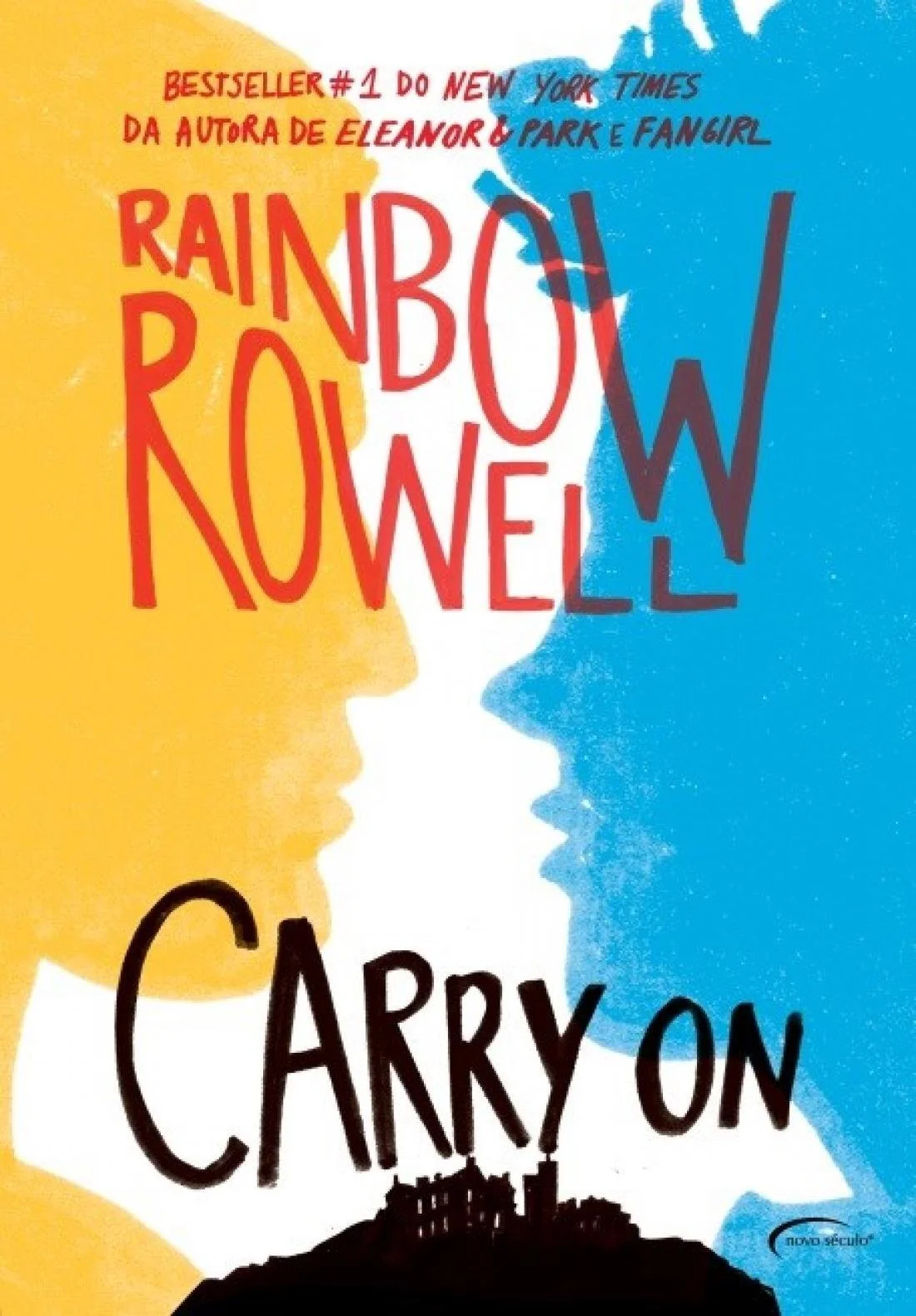
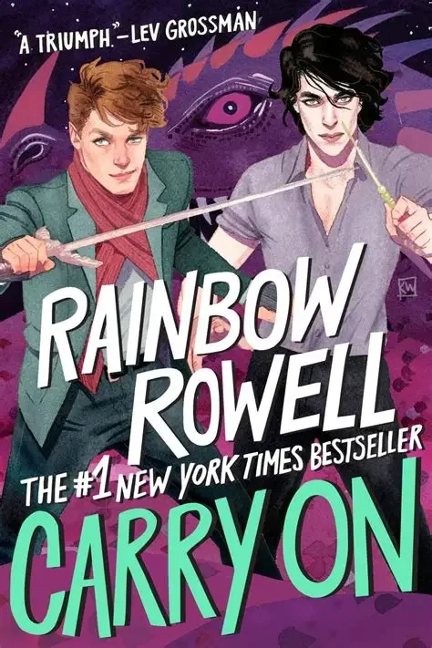
Carry On has always been one of my favorite books and is a large part of the reason why I came to accept my queer identity. This book has two different covers that I pulled inspiration from. The first-print cover left a lot to be desired, in my opinion. This was Rowell’s first fantasy novel; however, the cover treated it like it was another one of her romance books. This would draw readers of Rowell in, but it wouldn’t exactly grab the attention of the audience who wanted a fantasy romance. The second cover solved a lot of these problems, and is a personal favorite of mine, so I had a hard time figuring out how to reinterpret it. I decided to play into current Romantasy trends, giving the book a fresh look, playing on the reoccurring symbols of roses and fire. I also took inspiration from the original title font, starting with it, then enhancing it, giving the title a bit of my own flair. I also took it upon myself to experiment with interior layouts, creating an illustrated interior design for the book inspired by artists in the community who annotated their own copies of Carry On. These are featured bellow.
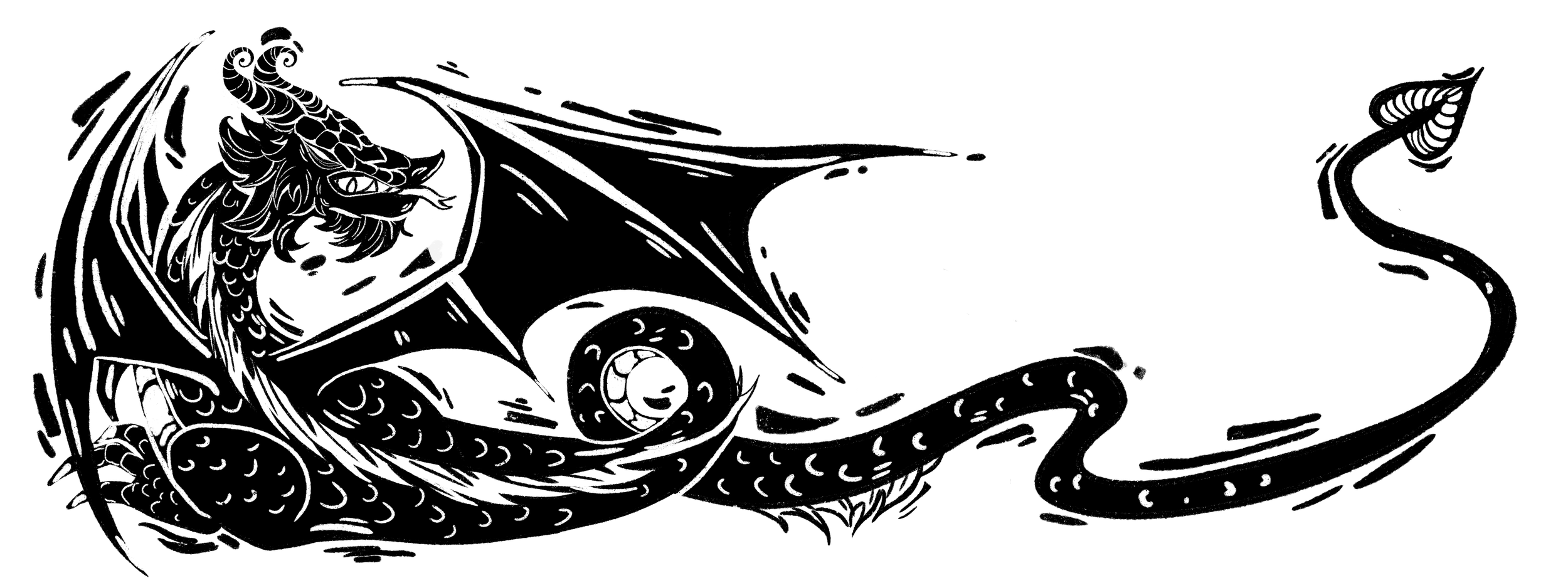
Chapter header design, 2026, digital
This header was meant to mimic the style of medieval illuminated manuscripts and old forms of printmaking to add to the medieval-style school setting of the book.
Redesigned Cover by Kevin Wada released by Macmillan
Original Cover design, released in 2016 by Macmillan
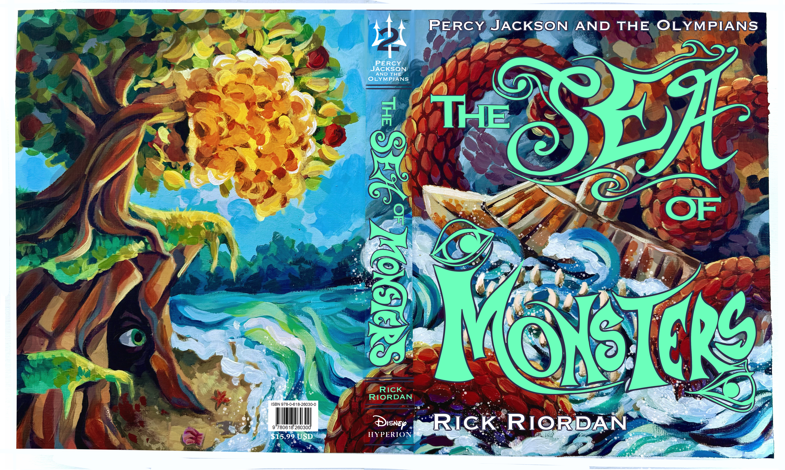
Percy jackson: The Sea of Monsters by rick riordan
Percy Jackson was inevitable when it came to this project. Especially since I’m looking to work in middle grade and YA books, I wanted to try my hand at a book from the Percy Jackson series. I started this design soon after season two premiered on Disney+, and I was in the midst of rereading The Sea of Monsters. I was always a big fan of the original and updated covers of this book, so I had a hard time figuring out how I wanted mine to stand apart. While rereading the book, I realized how closely of a retelling it was to Homer’s Odyssey, since I read parts of it in high school and college, and wanted to emphasize more of those mythological elements in my design. I also wanted to make sure the golden fleece made some sort of appearance, since that is the driving force behind the story. I experimented with a continuous design that spanned across the front, spine, and back cover, and decided to emphasize both the cyclops, and the intense scene with Scylla and Charybdis. I thought it’d be fun to contrast the intense scene crossing between these creatures on the front cover, and an idyllic beach scene for the back cover, since the fleece is described in the book to let vegetation thrive and beautify the island, in contrast to the dark cave the cyclops lives in (featured below the fleece). Overall, I’m happy with my experiment, and want to continue to create a continuous book design between the front and back covers.